How to read Qiskit figures
About one item in five of IBM's official sample test puts a picture in front of you: a circuit drawing, a histogram, a Bloch multivector, a q-sphere. Those items are cheap points if you can decode the picture at a glance — and expensive guesses if you cannot. This page is the decoder.
Nothing on this page is hand-drawn illustration. Each figure is produced by running the code shown next to it against the pinned stack (Qiskit 2.5.0) and committing the SVG, exactly like the proof artifacts behind the practice questions. The generator lives at data/figures/guide/generate.py; it is run twice into separate directories and the two sets of SVGs are compared byte for byte, so anything time-dependent or randomly sampled would fail the check. The four broadcasting diagrams are the one exception: they are schematics drawn with matplotlib primitives, not Qiskit output.
1. Circuit diagrams (mpl)
from qiskit import ClassicalRegister, QuantumCircuit, QuantumRegister

qr = QuantumRegister(2, "q")
cr = ClassicalRegister(2, "c")
qc = QuantumCircuit(qr, cr)
qc.h(0)
qc.cx(0, 1)
qc.barrier()
qc.measure(0, 0)
with qc.if_test((cr[0], 1)) as else_:
    qc.z(1)
with else_:
    qc.x(1)
qc.measure(1, 1)

qc.draw(output="mpl")
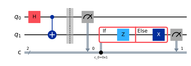
Read it left to right, one wire per qubit:
- Wire order.
q_0is drawn at the top by default — the opposite of the order in which qubits appear in a printed ket.draw(reverse_bits=True)flips the layout so the highest index is on top; it changes only the picture, never the circuit. (QuantumCircuit.reverse_bits()is a different thing: it returns a new circuit with permuted qubit indices, so its drawing still starts atq_0.) - Gate boxes carry the gate name; a filled dot is a control and the circled plus is the target of a CX. A parameterised gate shows its value inside the box, e.g.
Rz(pi/2). - The barrier is the dashed vertical band. It is a scheduling/optimization fence, not an operation.
- Measurements are the meter symbol, with a downward arrow into the classical wire and a small number naming the target classical bit.
- The classical register is the doubled line at the bottom, labelled with the register name and a slash carrying its width (
2here). A single doubled wire can stand for many classical bits. - Control flow appears as a labelled, boxed region attached to the classical wire: an
Ifpart, and anElsepart only when the code actually opened one. The condition is printed on the classical wire —c_0=0x1means "classical bitc_0equals 1". The other control-flow constructs render the same way: aswitchdraws aSwitchbox followed by oneCaseregion per case (the default case included), andfor_loop/while_loopdraw their own labelled box — aForbox carries its range in short form, e.g.r(0, 3)forrange(3). - Transpiled circuits look different in one specific way: their wire labels read
q_0 -> 0, that is virtual qubit to physical qubit. If you see those arrows, you are looking at post-layout output, and anySWAPyou see was inserted by the routing stage.
Docs: Visualize circuits · Classical feedforward and control flow
2. Histograms
import numpy as np
from qiskit import QuantumCircuit
from qiskit.quantum_info import Statevector
from qiskit.visualization import plot_histogram

qc = QuantumCircuit(3)
qc.ry(2 * np.pi / 3, 0)
qc.cx(0, 1)
qc.x(2)

counts = {str(k): round(v * 1000)
          for k, v in Statevector(qc).probabilities_dict().items()}
plot_histogram(counts)

- Bitstrings are little-endian. The rightmost character is qubit 0, so
100means qubit 2 is 1 and qubits 1 and 0 are 0. A large share of histogram items are really endianness items in disguise. - Bars are sorted by outcome label by default (
sort="asc"), not by height — so the tallest bar is not necessarily the last one. - The y axis follows your input: integer counts give a
Countaxis, probabilities give aProbabilitiesaxis.plot_histogramhas noshotsparameter; normalization comes from the data itself. bar_labels=Trueis the default, which is why every bar carries its value printed above it. Read the numbers before you compare heights.number_to_keep=kkeeps theklargest outcomes and pools everything else into one extra bar labelledrest, whose height is the sum of the folded counts (never their average, never the largest of them).- Multiple registers print with spaces: a key like
'01 00'is two registers, with the last-declared register drawn leftmost. Aftermeasure_all()on a circuit that already had classical bits, expect exactly that shape. plot_distributionis the same picture for quasi-probability data;legend=must be a list, one entry per execution.
Docs: Visualize results
3. Bloch multivector vs q-sphere
These two look superficially similar and encode completely different things. The exam exploits that.
Bloch multivector — one sphere per qubit
from qiskit import QuantumCircuit
from qiskit.quantum_info import Statevector
from qiskit.visualization import plot_bloch_multivector

qc = QuantumCircuit(2)
qc.h(0)
qc.x(1)

plot_bloch_multivector(Statevector(qc))
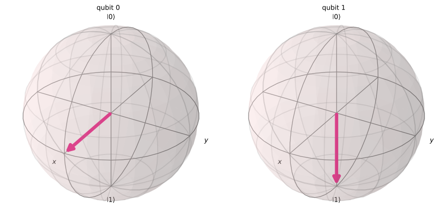
- One sphere per qubit, titled
qubit 0,qubit 1, … in index order (left to right), not in printed-ket order. - Each sphere shows that qubit's reduced state: the arrow is the Bloch vector of the single-qubit density matrix after tracing out the others.
- Direction is the whole message. North is
|0>, south is|1>,+xis|+>,+yis the state(|0> + i|1>)/sqrt(2).Htakes north to+x;Sis a quarter turn aboutz, so it takes+xto+y;Zmaps+xto-x. - A missing arrow means entanglement (or mixture). For a Bell state the reduced Bloch vector of each qubit is zero, and the drawer renders both spheres with no arrow at all — the individual qubits have no definite direction. Two full-length arrows therefore mean a product state.
- One sphere for a two-qubit state means somebody traced a qubit out first.
Q-sphere — one figure for the whole state
from qiskit import QuantumCircuit
from qiskit.quantum_info import Statevector
from qiskit.visualization import plot_state_qsphere

qc = QuantumCircuit(3)
qc.h(0)
qc.h(1)
qc.t(0)

plot_state_qsphere(Statevector(qc))
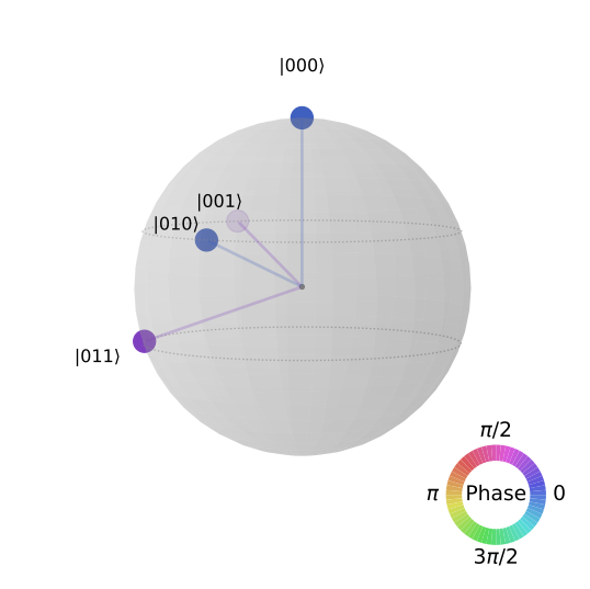
- Position (latitude) is the Hamming weight of the basis state: all-zeros at the north pole, all-ones at the south pole, one ring per number of 1s in between. Longitude just spreads the states within a ring.
- Marker size is the magnitude of that amplitude. Equal markers mean an even superposition; a missing marker means amplitude zero.
- Marker colour is the phase, read against the colour wheel drawn beside the sphere (0 at the right,
pi/2at the top,piat the left). Heret(0)puts a phase ofpi/4on every basis state whose qubit 0 is 1 — that is001and011— so those two markers differ in colour from000and010. - Global phase is invisible: multiplying the whole state by a phase changes nothing in the picture. Only relative phases move colours.
show_state_phases=Trueprints the phase next to each label; it is off by default, which is exactly why a q-sphere item can hinge on colour alone.
Phase on a q-sphere is carried by colour and nothing else. Practice questions whose answer depends on it are marked color_essential and are dropped from the e-ink/EPUB build, where the alt text states the phases instead.
Docs: Plot quantum states · qiskit.visualization API
4. The four broadcasting patterns
An Estimator PUB is (circuit, observables, parameter_values), and the observables and the parameter values are broadcast against each other with the NumPy rules: compare shapes from the right, a length-1 axis stretches, a missing leading axis is padded with 1. The primitive input/output guide names exactly four patterns — learn to recognise them from the shapes.
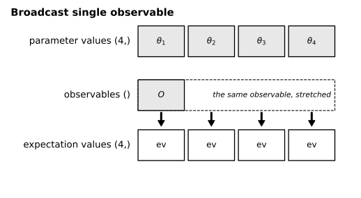
Broadcast single observable
One observable, several parameter sets: observables shape () against parameter values shape (5,) gives (5,).
Zip
Equal shapes pair element-wise: (5,) against (5,) gives (5,) — observable i is evaluated only at parameter set i.
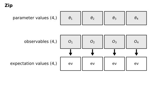
Zip and broadcast-single-observable produce the same result shape, so a result shape alone cannot tell them apart — look at the observables array: () means broadcasting a single observable, an array equal in shape to the parameter values means zip.
Outer / product
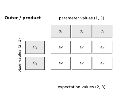
Complementary singleton axes — a column against a row: (4, 1) against (1, 6) gives (4, 6), every observable against every parameter set.
Standard nd generalization
Different ranks: parameter values (3, 6) against observables (2, 3, 1). The shorter shape is right-aligned and padded with a leading 1, then each length-1 axis stretches, giving (2, 3, 6).
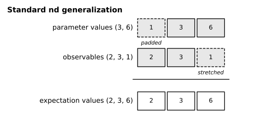
Two shapes are not broadcastable when an axis pair disagrees and neither entry is 1 — (3,) against (4,) raises. And remember: a SparsePauliOp counts as one observable however many Pauli terms it holds, so a multi-term operator returns a single expectation value, not one per term.
Docs: Primitive inputs and outputs
Quick checklist for a figure item
- Circuit? Check the wire order first (
q_0top?q_v -> plabels?), then look for a boxed control-flow region and where each measurement lands. - Histogram? Read the bitstrings right to left, read the printed bar values, and ask whether a
restbar should be there. - Spheres? Count them. Many spheres means Bloch multivector (direction matters); one sphere with labelled markers means q-sphere (latitude, size and colour matter).
- Shapes? Write the observables shape above the parameter-values shape, right-aligned, and apply the three NumPy rules before naming the pattern.
Drill these on the Section 2 questions (visualization), Section 3 (transpiled-circuit drawings) and Section 4 (broadcasting).